
I like it … and it would be a great way to use up a lot of scraps of pale fabric, and could have just about any colour background.

Love the second design … and there is space for quilting to feature!
read more
I like it … and it would be a great way to use up a lot of scraps of pale fabric, and could have just about any colour background.

Love the second design … and there is space for quilting to feature!
read more
The opposite of White Out, this is much nicer than looking at quilt designs during a power blackout!
(The best place I have ever been in during a power blackout was a chocolate factory! There was just enough light from the emergency lights to see what was on offer in he factory shop, and the aroma was beautiful.)
The first design for today would look better with a much narrower border … perhaps just a black binding.
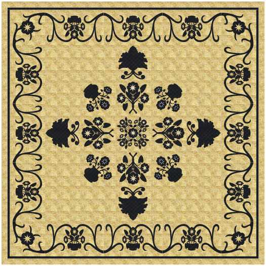
I love the second one just as it is.
Well, perhaps I would change those big blobs into something with a bit more detail.
read more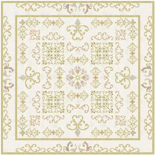
Love the idea of a very low contrast quilt like these, but I don’t think I want to live with one.
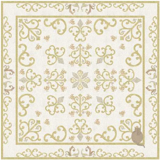
At least that saves me the task of picking out one design to make!
read more
The hardest part of making a quilt with applique designs ‘whited out’ would be choosing the background colour, then finding a collection of fabrics for the very low contrast in the appliques.

My favourite of these two is the second!
read more
A very restful design … which is my excuse for not using the background fabric in the corners … I must have had my eyes closed!

Still blank corners, and I quilted over the cat!
read more
Love the one above … all neat and tidy, with room for the quilting to shine. Quilting would be in thread to match the applique.

I placed the appliques facing the opposite direction to what I would normally do … and it’s OK.
However, if I was making the design into the real deal I would at least lay the blocks out on a bed before I joined them together to see which way I liked them most.
read more
Wonder how long it would take me to find the perfect background fabric … and then the perfect fabric for the applique. Or perhaps the perfect fabric for the background, and the perfect thread for the machine embroidery?

Or perhaps some applique for the big piece applique blocks, and the fiddly bits embroidered! Then another thread for the quilting.
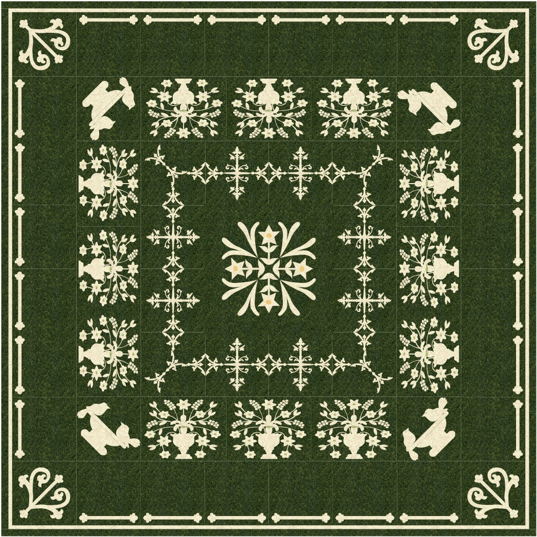
In all three of these designs I love the open spaces around the white bits … more white would make the designs too busy.
read more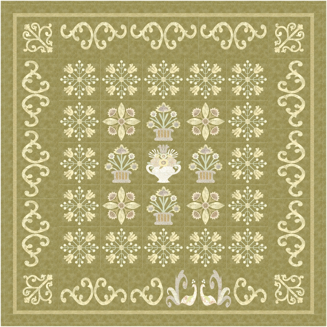
Love this idea of subtle colourings, and finding just the right fabrics might mean spending way too much time in a quilt shop. I think it would be time well spent!
But then, any time spent in a quilt shop is well spent.

Love the second one!

I like the last one too.
read more
I love this, despite the background fabric not being very inspiring. I was looking for something to make the quilting show clearly as a virtual quilt rather than a real quilt.
read more
Love this.
I would never have thought of using floral applique block designs without also using colours. I am not sure how I managed to remove all the colours from a quilt top, but I rather liked the effect, and I have one of these on my list of quilts I want to make. Hardest part will be choosing the background colour!
read more